I have been ask several times how I made Bailey's Bursting Page so I thought I would share some things I did to make this page unique and all it's own.
I'm going to call this mini series Evolution of a Page. Fits right? I've been wanting to do this for quit some time and will do more of these if you like them.
Here is the finished page in case you haven't seen it. This was the day my Miss Bailey took off her swimming wings for the very first time. She had way too much fun "bursting" up through the water.
It's usually the photo that inspires me how a page will look in the end. Alone, this photo is… ok, but I wanted it to tell more of the story of how Bailey felt like she had butterfly wings lifting her out of the pool as she bursted through the water.
I had a good idea how I wanted the finished page as I was inspired by a page from a fellow scrapper Andrea Chaberlain.

The background was created from one of the papers from Inspired Painted Cardstocks
I used one of the lighter ones. I loved the watery splashed colors on the paper, but it was a little darker than I wanted for this page.
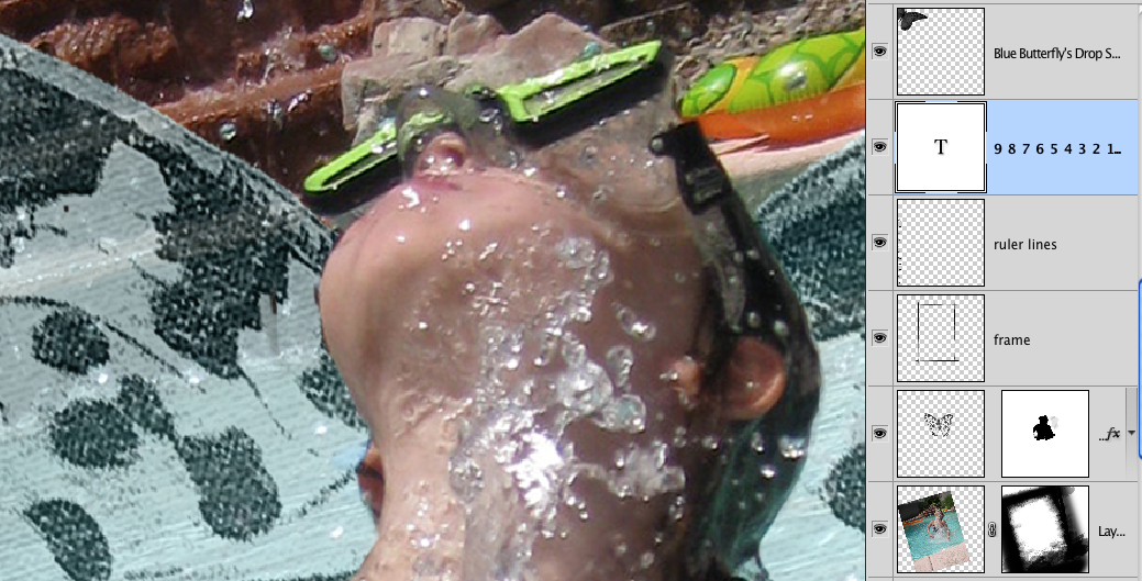
I usually bring in my photo right away so I can see how the colors will work, so I brought my photo in and rotated it into approximately where I wanted it.

As you can see, the paper just doesn't match quite right.
First I added a new layer beneath my paper layer. Because I wanted this overall lighter, I picked a color just a tad darker than white.
See below where the small circle is on the color picker. Don't worry about being exact, we can always lighten or darken this later to our taste.


1- With your paper layer highlighted, click the Fx button at the bottom of the layer’s palette to bring up the dialog box.
2- Click “Color Overlay”
3- Pick an almost white color in the top left corner of the color picker. Click ok.
4- Change the blend mode to Screen. Bring down the opacity a tad (I used 77%), till it looks like where you want it.
Of course you do this with any color you like to fit the look you want. Go ahead and play with different colors to see the different effects you can create.

This is how my background paper looks now.
It more of a watery color washed and I think it goes much better with this photo.
My next step was to create a mask for the photo.
I used some of my own watercolor splats extracted, but you can find some splat brushes from a free brush site to use.
I created a layer mask on my photo layer and using my brush with color black, I dapped it all around the photo edges I wanted to block out.
To do this so it didn't look like a line of the same brush, I set my brush settings to flip x & y jitter, Angle jitter, scattering and also I applied a watercolor texture I had just for an added effect.
Here's some screen shots of those settings for a visual.

And here is how my mask ended up with a close up screen shot along with a shot of my layer so you can see how I brushed around the edges.

I wanted some watery splashes below the photo too to blend from the photo to the background also.
First, I created a new layer above the photo layer.
Then I used my eyedropper to pick some colors from the pool water and used the same brushes I used around the mask area and just started brushing changing my color every now and then just dapping my brushes as I went. I varied the opacity of my brushwork too as I neared the photo and the outside area edge to blend into my background paper.
This is what I ended up with after that. Perfect match because I used the color of the photo's water.

Pretty kewl huh?
The I sketched in the word BURST on a new layer, but you could use a font too and arc it using your Warp Text option.
I selected the outside area of word, inverted the selection, and then expanded this selection by 20 pixels.
I created a new layer below my word layer.
Picked some colors from the orange raft in the background and using my watery splat brushes again, I just painted in the selected area changing my colors as I brushed.
TIP: While you have your brush selected, you can hold your ALT or OPTION key down to change over to the eyedropper tool on the fly. Pick your new color, release the key and brush. Very handy!
Here is a close up of the kewl watery title that I think fits perfect for this layout.

I used my ink splat brushes to splash ink around the edges of the page (just because I love inks), and wanted to carry that splash effect out but with some oomph.
Added in the butterfly from my Inspired Inklings and the orange butterfly from QPT-31 (see how you can reuse those elements from our PSD layered templates?).
The ruler lines are from Inspired Elements. I did erase the numbers so I could put the 0 at the bottom to look like I was measuring the height she was bursting upward.
I then added one of the frames from Inspired 2 and stretched it to size using the transform grip.
The inky butterfly sitting on the letter T in the title? I used my magic wand with continuous option off, to select the black from the orange butterfly, then did a control J to copy it to a new layer.
Moved it using the Move tool (V), rotated it into position and then erased half of the wings to make it appear like a side view like he was sitting on top of the T. I like the rub-on or stamped effect this gives.
See here zoomed way in. Way to extend the stash too!

Miss Bailey's "wings" were created the same way doing this and recoloring the orange to blue. Then I put those wings on top of her photo, created a layer mask on the wing layer, and using a small round hard brush with black on the mask, I painted in the part of Bailey I wanted to show so it looked like the wings were behind her. I could have just erased the part of the wings too, but I prefer to use layer masks in case I mess up or don't like it and I can paint back in with white. Just make sure you zoom in to get close to the edges. Here's a close up with the layers shown so you can get a visual.
Added my journaling and again picked an orange color from the raft to accent key words.
That was it. I think the entire layout took me about an hour or so, but I did know the look I was going for and did have my notes in my page booklet for this photo.
Hope you enjoyed a peek into my process and learned something new today. If you have any questions, please ask! You can post here or ask in our help forum. We are always willing to help you create your pages and explain things more in-depth.
Till next time,
PS: If you have read this entire post you must be really interested in this effect. SO, tell me how you liked the post or something you'd like to learn more about or even how you would use these watercolor splats and I'll randomly pick one commenter to WIN a set of my brushes that I plan on releasing next week. :D


I love tutorials! Thanks for giving us an insight to the lovely artistic pages!