
So as I promised, I have a little video of my entire process of creating Miss Bailey's I have Vocal Cords page I showed you yesterday here.
This is a very simple page, took me all of 17 minutes exactly to make. This is not really an instructional video, it's just to show you my own thought processes when I'm creating a page, but hopefully it will give you some ideas too. This is uncut and raw! LOL So please forgive any rambling. ;)
I'll try to the other one for this week of the artsy page I did also for this photo just to show that process I did.
Credits for Layout: Color Play 2 (to be released Sept 12th)

Showing posts with label Evolution of a Page. Show all posts
Showing posts with label Evolution of a Page. Show all posts
Evolution of an Art Page Inspiration
Tuesday, June 12, 2012
WOW - There are times, a lot lately, I see how utterly creative my Creative Team is!


Look at Judy's awesome art page she created! I was totally taken away with Judy's Art Page she did this week and asked her if she would share some of her process with us. She graciously agreed and I am thrilled to share it with you here.
Scrapbooking and Art Journaling doesn't always have to have a purpose or be about a memory... it's a wonderful creative outlet too for those who don't like to get their hands dirty and for those who just don't have the money to spend on the tons of products it would take to create art in real life.
Using digital art is so easy and inexpensive compared real life art. So if you have been wanting to dip your toes in the waters of creating beautiful art pages too, why not give it a go?! What's the worst that can happen? You delete it... or create a unique one of kind art piece that you are seriously considering printing to hang on your wall! :D
Thank you again Judy for sharing your process!
I started with a paper background layer from FYA Discover Papers
I brought in my Image to the above layer and copied it for 2 so I could get it as dark as I wanted. First image layer @ 100% opacity and layer blend mode set to Multiply, the second image layer was set @65% opacity and again Multiply blend mode.
Next is an overlay from Artbox 15 #1, which isolated the upper portion of the image.
This was used with a layer mask below it to open up some areas at the bottom to include a bit of the hair and dress. Blend mode was normal and a paper layer was clipped to it for the desired color.
Another overlay was then used, FYA Discover Masks and Mattes Overlay #1, normal blend mode and opacity reduced to 52%.
Layer 9 is my own personal icon/logo set in the border.
The next layer is where the magic really happens. The textures on the butterfly created such marvelous patterns when the blend mode was set on multiply. To add even more interest and emphasis I added a drop show and an inner shadow.
The word discover was done with the font CK Fill and The areas to be filled were selected and then filled with a portion of the image found on the upper edges. A slight drop shadow was added.
Final butterfly was added in left bottom for balance, multiply blend mode and opacity @ 79%.
I think a lot of what makes this page striking is the level of detail and interesting colors and patterns found in the original image from Far Far Hill Blog. Can only say how lucky I was to have stumbled upon it. Love the Art Deco style so was drawn to all the women in the set.
Here is a screen shot of all the layers within my PSD file.

Credits:
| ||||||


Published again and playing catch up with life
Sunday, June 03, 2012
Hi there everyone! I know, I know... been a loooooong time! It's been a H __ LL of a month around here and if you know me personally, you are probably wondering if I still have a brain left! LOL read to the end for my summary of the month.
 But first... I am honored again to have been published by Scrap Street Mag and the cover story for Make it Manly.
But first... I am honored again to have been published by Scrap Street Mag and the cover story for Make it Manly.
Here's a peek. Click the preview too to read the techniques I used to create this page.
I created this page with my Beautiful Mess 2 Mixed Media Kit.
I created this page with my Beautiful Mess 2 Mixed Media Kit.
Thank you ScrapStreet for requesting another layout to be shared with your subscribers!
So onto the my past month's summary for you inquiring minds who need to know….
My jaw surgery went fine, so they tell me... but I have somehow lost 2 weeks to little green men who stole my brain and made me an up and down emotional mess on pain meds. Not completely done yet, but the bone grafting and 4 mini posts in my jaw are tolerable now and I won't be reaching for anything stronger than aspirin again! {can you hear my family cheering in the background? lol} Now just to recover from the financial blow of it all (and pay for the next 5 years on a loan), and not having medial insurance. big ugggg!
As for the rest of the month... my son finally passed his kidney stones after several weeks of agonizing pain... I learned he handles pain meds much better than I do!
My daughter has recovered physically from loosing the baby and time will heal the heart. And we have been firmly reminded that everything happens for a reason... and unfortunately she also had to learn a difficult life-Lesson this past month too that had nothing to do with the pregnancy, but ended up with her and Miss Bailey taking shelter with us for a spell...
And that made for a little chaos around here as they brought with them a puppy.... who has made herself at home finally with my yellow lad/golden retriever Gracie. She really is a good puppy, overlooking her need to eat anything paper including the occasional toilet paper roll and excitable peeing when someone new comes to visit.
My bf was laid off for the 2nd time in just over a month, but did find a new job thankfully AND he even got my daughter a full time position there too as she couldn't find anything other than part time for the last year! Whoo Hoo!
Now it's just a matter of waiting for those first checks that doesn't come for a month... uggg. We had just about recovered from the month before lay off financially.
Does the drama every end? lol Hate drama! So ready to get back to normal days and life! {without the green men mind you!} ;D
Just breathe Cilenia, just breathe!
Off to get caught up now. I have your new Art Journaling challenge at Digitals for June to get posted! Watch tomorrow for all the info how to play and receive your Bonus Mini kit for participating. :)
Little sneak peek of the bonus kit. And look for a full kit to coordinate with this later this week too!
Ciao!

Off to get caught up now. I have your new Art Journaling challenge at Digitals for June to get posted! Watch tomorrow for all the info how to play and receive your Bonus Mini kit for participating. :)
Little sneak peek of the bonus kit. And look for a full kit to coordinate with this later this week too!
Ciao!

Evolution of a Page - Techniques for tearing paper and blending
Friday, October 14, 2011
I've been playing with one of my favorite digi playmate's kits A Walk in the Woods by Aria aka Lynne, and wanted to experiment with some blending effects and layering elements as it's been a hot topic with my digisister group. >waving< Hi girls!
By the way, this kit is awesome for Fall layouts and also for any woodsy type of photos you might have. I just loved it and felt honored she let me play with it before it was released!
So here is the page I am making today of my eldest son Adam and his son Ashton. Perfect pictures for of them to use with this kit.

So I started with two of her awesome artsy papers and brought in one of my town edges from my Beautiful Mess 1 kit as I wanted to quickly tear one of the papers for layering.
The fist thing I do is pull all three into a new canvas with the torn edge on top. I had to size it up slightly using my transform grips to make sure it was over the edges of the canvas so it tore completely down the whole paper.
I used my my Magic Wand tool (W) and selected the area to the right of the torn edge. (see the marching ants around my selection below).
Then I went to the main menu Select>Modify>Expand and enlarged by 2px so that it was slightly larger than my torn edge.

I clicked onto my top paper layer and at the bottom of my layers panel, I clicked the Add Vector Mask icon. This masked over the part NOT selected, so I simply type Cmd/Ctrl I to invert the mask for the right side of my paper to be masked.

Now of course, my torn edge does not match the color scheme here. Easy peasy fix. I simply applied a color overlay using the Fx layer style by double clicking on the layer grey area.
I picked one of the lighter creamy colors from her paper, changed my blending mode to Overlay to retain some of the texture and clicked ok.

Next I dragged my torn edge layer below my top paper layer and with my Move Tool selected (V), I used my arrow keys and nudged it over 3 pixels by tapping the right arrow key 3 times so that just a tip of the creamy torn edge just peeks out from under the darker paper on top as if it was actually ripped like in real life.
I gave the torn edge a slight shadow, by again double clicking on the grey area of my layer in the layers panel, and setting my shadow setting to be 75%, 3px distance, 5px size and changed the blend mode to Linear Burn, so that it was just slightly lifted from the bottom paper for what I feel is the most realistic look for a paper on top of a paper.

Next I found she had an torn note paper element in her kit, so I brought that in under my torn edge layer. It was a little too busy for my photo, so I duplicated the top paper, dragged it over the torn note paper and clipped it to that to carry the color from the larger torn edge. Then I applied a drop shadow, created that into a layer by right clicking on the Fx icon on the layer and nudging the shadow layer a tad to make it appear the torn note paper is slightly lifted at it's corners.
I added one of my torn ledger papers, again from Beautiful Mess 1, then my photo on top and one of her element sticks and staples on top of that to ground and attach my photo.
so here is what I have so far. I'm sure I will tweak all of these and their placements as I develop the page, but this gives me a good visual of what I know I'd like to do.

Lynne has all these awesome fall leaves, some painted leaves and woodsy flowers in her kit, so I know I want to use some of those too. I'm sure some of them I will simply pull in, cluster or tuck in here or there with custom warped shadows but also wanting to play with another photo I have that I want to blend in here and maybe use some of these leaves to create a photo mask with and also thinking I could create a brush from 1 to blend in my next photo too.
 So here was my progression of each added piece and what I did. It's really about playing with your specific photos and elements to find the arrangement you find most appealing. Do NOT think that I just simply dropped these in and placed and left them, I think I rearranged this layout 5 times before finding what I liked the most. That's part of the fun and all the while thinking about my boys and what maybe I will write as journaling on this.
Added some leaves tucked in here and there and peeking out above and beneath papers.

Added a leaf, enlarged and clipped a photo to it and tucked it under my torn paper.
I cut a piece of the background paper out using my marque tool and copying to a new layer. (select your area with the marque tool (M), and then click Cmd/Cntl J to copy to a new layer.)
I gave this a low shadow and added my journaling and turned both the paper piece and the journaling slightly using my transform grips and moving just under the leaf photo.

Then I used the same photo on the top corner, flipped it horizontally, (Edit>Transform>Flip Horizontal), changed my blend mode to Multiply, duplicated the layer, and changed it to soft light to lighten it up, but still blended into the background.
I lowered the Multiply layer's opacity down to 33% to lighten it up a bit and blend in nicer.
I then created a brush from the large leaf.
Select Cmd/Ctrl click on the layer's icon to select, and from the main menu, Edit>Define Brush Preset.

I added a layer Mask to each of the photo layers.
And painted black on the mask with this leaf brush with varied opacities of flow to blend in my photo to the background.


By the way, this kit is awesome for Fall layouts and also for any woodsy type of photos you might have. I just loved it and felt honored she let me play with it before it was released!
So here is the page I am making today of my eldest son Adam and his son Ashton. Perfect pictures for of them to use with this kit.

So I started with two of her awesome artsy papers and brought in one of my town edges from my Beautiful Mess 1 kit as I wanted to quickly tear one of the papers for layering.
The fist thing I do is pull all three into a new canvas with the torn edge on top. I had to size it up slightly using my transform grips to make sure it was over the edges of the canvas so it tore completely down the whole paper.
I used my my Magic Wand tool (W) and selected the area to the right of the torn edge. (see the marching ants around my selection below).
Then I went to the main menu Select>Modify>Expand and enlarged by 2px so that it was slightly larger than my torn edge.

I clicked onto my top paper layer and at the bottom of my layers panel, I clicked the Add Vector Mask icon. This masked over the part NOT selected, so I simply type Cmd/Ctrl I to invert the mask for the right side of my paper to be masked.

Now of course, my torn edge does not match the color scheme here. Easy peasy fix. I simply applied a color overlay using the Fx layer style by double clicking on the layer grey area.
I picked one of the lighter creamy colors from her paper, changed my blending mode to Overlay to retain some of the texture and clicked ok.


I added one of my torn ledger papers, again from Beautiful Mess 1, then my photo on top and one of her element sticks and staples on top of that to ground and attach my photo.
so here is what I have so far. I'm sure I will tweak all of these and their placements as I develop the page, but this gives me a good visual of what I know I'd like to do.


Added some leaves tucked in here and there and peeking out above and beneath papers.

Added a leaf, enlarged and clipped a photo to it and tucked it under my torn paper.
I cut a piece of the background paper out using my marque tool and copying to a new layer. (select your area with the marque tool (M), and then click Cmd/Cntl J to copy to a new layer.)
I gave this a low shadow and added my journaling and turned both the paper piece and the journaling slightly using my transform grips and moving just under the leaf photo.

Then I used the same photo on the top corner, flipped it horizontally, (Edit>Transform>Flip Horizontal), changed my blend mode to Multiply, duplicated the layer, and changed it to soft light to lighten it up, but still blended into the background.
I lowered the Multiply layer's opacity down to 33% to lighten it up a bit and blend in nicer.
I then created a brush from the large leaf.
Select Cmd/Ctrl click on the layer's icon to select, and from the main menu, Edit>Define Brush Preset.

I added a layer Mask to each of the photo layers.
And painted black on the mask with this leaf brush with varied opacities of flow to blend in my photo to the background.
Here was my final result. Added my Title and a date and called this done.
I encourage you to play a little with any of the techniques I have done here. Each can add it's own uniqueness to your layouts. Once you master one, add another one. Then start combining them to create your own beautiful memories.
If you have any questions on any of the items here, please feel free to visit us in the Tech Talk forum at Digitals. I would be happy to explain in detail on any of these techniques, and you never know, it just may appear in one of our newsletters at Digitals that we will be starting up Oct 22nd on Tuesdays. I'm calling it "Skill Building with Digitals", so be sure you are signed up to receive these.
Till next time,

Evolution of a Page - Painted Template 1 + a coupon
Tuesday, July 12, 2011
There is no doubt about it, I love my paints and getting all artsy in real life and in digital. What I love even more is I am now merging the two by painting my usual mixed media backgrounds and bringing them into digital by scanning and turning them into wonderful textures, overlays and photo masks. I used to have to print a photo and glue onto my canvas and paint wash over (hoping I didn't mess it up), and adding all my embellishments. With the digital age, I don't have to worry about that any more! Yeah for digi!
Today I want to show you an effect I did years ago in real life art that I have now created digitally using some current photos of sweet Lilith and her Grandpa.
I started with my Painted Template 1, a new series I hope to be bringing you weekly each Tuesday. It's on sale Tuesday and Wednesday this week 20% off, but because you are reading this, you can get a coupon to get it free with any other purchase from my shop. Just make sure you add it into your cart with your other purchases before applying the coupon code. CODE: paint-T1
 When you open this template, you will notice a background with a fill color of the blue. You can leave this or fill with your color of choice, or put in a paper instead. I will leave the color as I like it with the photos I have chosen.
The first thing I think about is my large photo I want "painted" into my background. I added a sun flair using the Photoshop filter lens flair because I already had a nice behind lighting of the sun I wanted to artsy up a bit. In Photoshop CS it is FILTER>RENDER>LENS FLAIR from your top menu bar. Move the flair to where you want and adjust the brightness until you like it. Remember, if you don't like the effect, you can undo and try again.
Here's my before and after of my large photo.
Yes, I cleaned up the spit up too! LOL Easily done with my cloning brush with a little patience. lol

I then dragged in my photo to just above my "Large Photo Mask" layer in the template. Clipped it to that layer. In CS you hover between the two layers holding your alt key and click with your mouse.


Today I want to show you an effect I did years ago in real life art that I have now created digitally using some current photos of sweet Lilith and her Grandpa.
I started with my Painted Template 1, a new series I hope to be bringing you weekly each Tuesday. It's on sale Tuesday and Wednesday this week 20% off, but because you are reading this, you can get a coupon to get it free with any other purchase from my shop. Just make sure you add it into your cart with your other purchases before applying the coupon code. CODE: paint-T1

The first thing I think about is my large photo I want "painted" into my background. I added a sun flair using the Photoshop filter lens flair because I already had a nice behind lighting of the sun I wanted to artsy up a bit. In Photoshop CS it is FILTER>RENDER>LENS FLAIR from your top menu bar. Move the flair to where you want and adjust the brightness until you like it. Remember, if you don't like the effect, you can undo and try again.
Here's my before and after of my large photo.
Yes, I cleaned up the spit up too! LOL Easily done with my cloning brush with a little patience. lol

I then dragged in my photo to just above my "Large Photo Mask" layer in the template. Clipped it to that layer. In CS you hover between the two layers holding your alt key and click with your mouse.

See how it's already an artistic photo? Now if you want, you can play with the layer's blending mode of the overlay and or the photomask for totally different effects. The beauty of this template!
In the above example I left the Overlay texture blending on Overlay with a 33% opacity, and the photomask with an overlay blending and 100% opacity. But feel free to play!
Here's just a FEW things you can do to change the look.
Want a dark rich color on the photo? Change the Overlay texture layer to multiply or linear burn and up the opacity.

Want a ungrunged cleaner photo? Change the photomask to a Normal blending mode instead of an overlay.

Change the mask to a Screen layer mode and take the opacity up to around 65%.

And of course you can always turn off, adjust or delete the Overlay layer also.
Next I added my smaller photo and simply clipped to the small photo painted mask. Added my journaling, a date above the line and the added title of Baby Lilith.
DONE! Now I could add more, but the beauty and simplicity of the moment was what I was after for this, but with my usual artistic flair. I plan on making an opposite page with more photos of these two and some journaling of Grandpa's thoughts about his precious little baby Lilith. I will use the same template, but may rotate it, move it around, or bring in some other elements… will have to see when I get there. :)
My finished page. Isn't the moment just Simply Beautiful?! (Minus the spit up of course! lol)

Hope you enjoyed a little peek into my process and I would love to see how you use this template so be sure and show us in my gallery at Digitals! Be sure to check out more inspirations there using my products for tons of creative ideas! And who knows… you might be picked for Layout of the Day too from our First Responders!
Here are some more of my New Releases this week and all are on sale Tuesday and Wednesday this week along with a few of last week's releases.
Tags 1 Re-released and a New Tags 2. Both PU/S4H/CU licensed.


Stitches 05 available for PU or CU

Join me again here next Tuesday for another "Evolution of a Page" and a new Painted Template.
Technique Thursday - Evolution of a Page
Thursday, March 24, 2011
I have been ask several times how I made Bailey's Bursting Page so I thought I would share some things I did to make this page unique and all it's own.
I'm going to call this mini series Evolution of a Page. Fits right? I've been wanting to do this for quit some time and will do more of these if you like them.
Here is the finished page in case you haven't seen it. This was the day my Miss Bailey took off her swimming wings for the very first time. She had way too much fun "bursting" up through the water.
It's usually the photo that inspires me how a page will look in the end. Alone, this photo is… ok, but I wanted it to tell more of the story of how Bailey felt like she had butterfly wings lifting her out of the pool as she bursted through the water.
I had a good idea how I wanted the finished page as I was inspired by a page from a fellow scrapper Andrea Chaberlain.

The background was created from one of the papers from Inspired Painted Cardstocks
I used one of the lighter ones. I loved the watery splashed colors on the paper, but it was a little darker than I wanted for this page.
I usually bring in my photo right away so I can see how the colors will work, so I brought my photo in and rotated it into approximately where I wanted it.

As you can see, the paper just doesn't match quite right.
First I added a new layer beneath my paper layer. Because I wanted this overall lighter, I picked a color just a tad darker than white.
See below where the small circle is on the color picker. Don't worry about being exact, we can always lighten or darken this later to our taste.


1- With your paper layer highlighted, click the Fx button at the bottom of the layer’s palette to bring up the dialog box.
2- Click “Color Overlay”
3- Pick an almost white color in the top left corner of the color picker. Click ok.
4- Change the blend mode to Screen. Bring down the opacity a tad (I used 77%), till it looks like where you want it.
Of course you do this with any color you like to fit the look you want. Go ahead and play with different colors to see the different effects you can create.

This is how my background paper looks now.
It more of a watery color washed and I think it goes much better with this photo.
My next step was to create a mask for the photo.
I used some of my own watercolor splats extracted, but you can find some splat brushes from a free brush site to use.
I created a layer mask on my photo layer and using my brush with color black, I dapped it all around the photo edges I wanted to block out.
To do this so it didn't look like a line of the same brush, I set my brush settings to flip x & y jitter, Angle jitter, scattering and also I applied a watercolor texture I had just for an added effect.
Here's some screen shots of those settings for a visual.

And here is how my mask ended up with a close up screen shot along with a shot of my layer so you can see how I brushed around the edges.

I wanted some watery splashes below the photo too to blend from the photo to the background also.
First, I created a new layer above the photo layer.
Then I used my eyedropper to pick some colors from the pool water and used the same brushes I used around the mask area and just started brushing changing my color every now and then just dapping my brushes as I went. I varied the opacity of my brushwork too as I neared the photo and the outside area edge to blend into my background paper.
This is what I ended up with after that. Perfect match because I used the color of the photo's water.

Pretty kewl huh?
The I sketched in the word BURST on a new layer, but you could use a font too and arc it using your Warp Text option.
I selected the outside area of word, inverted the selection, and then expanded this selection by 20 pixels.
I created a new layer below my word layer.
Picked some colors from the orange raft in the background and using my watery splat brushes again, I just painted in the selected area changing my colors as I brushed.
TIP: While you have your brush selected, you can hold your ALT or OPTION key down to change over to the eyedropper tool on the fly. Pick your new color, release the key and brush. Very handy!
Here is a close up of the kewl watery title that I think fits perfect for this layout.

I used my ink splat brushes to splash ink around the edges of the page (just because I love inks), and wanted to carry that splash effect out but with some oomph.
Added in the butterfly from my Inspired Inklings and the orange butterfly from QPT-31 (see how you can reuse those elements from our PSD layered templates?).
The ruler lines are from Inspired Elements. I did erase the numbers so I could put the 0 at the bottom to look like I was measuring the height she was bursting upward.
I then added one of the frames from Inspired 2 and stretched it to size using the transform grip.
The inky butterfly sitting on the letter T in the title? I used my magic wand with continuous option off, to select the black from the orange butterfly, then did a control J to copy it to a new layer.
Moved it using the Move tool (V), rotated it into position and then erased half of the wings to make it appear like a side view like he was sitting on top of the T. I like the rub-on or stamped effect this gives.
See here zoomed way in. Way to extend the stash too!

Miss Bailey's "wings" were created the same way doing this and recoloring the orange to blue. Then I put those wings on top of her photo, created a layer mask on the wing layer, and using a small round hard brush with black on the mask, I painted in the part of Bailey I wanted to show so it looked like the wings were behind her. I could have just erased the part of the wings too, but I prefer to use layer masks in case I mess up or don't like it and I can paint back in with white. Just make sure you zoom in to get close to the edges. Here's a close up with the layers shown so you can get a visual.
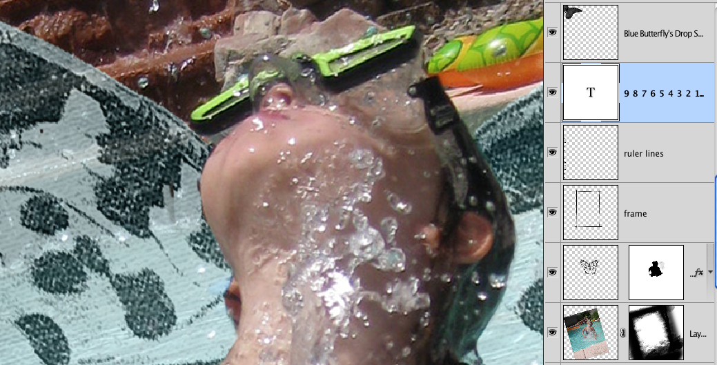
Added my journaling and again picked an orange color from the raft to accent key words.
That was it. I think the entire layout took me about an hour or so, but I did know the look I was going for and did have my notes in my page booklet for this photo.
Hope you enjoyed a peek into my process and learned something new today. If you have any questions, please ask! You can post here or ask in our help forum. We are always willing to help you create your pages and explain things more in-depth.
Till next time,

PS: If you have read this entire post you must be really interested in this effect. SO, tell me how you liked the post or something you'd like to learn more about or even how you would use these watercolor splats and I'll randomly pick one commenter to WIN a set of my brushes that I plan on releasing next week. :D
Evolution of a Page - A little Art Journaling today
Friday, August 13, 2010
Some days I just have to get my hands dirty and do a little Art Journaling... well.. digi hands that is! LOL

I decided to journal a quote by Thoreau that I admire and believe... and honestly needed to just SEE in front of me.
And since I was asked how I paint in digi... I thought I would give a little step by step of my thought process. Remember! There is no right or wrong way to paint or express!

I started with a blank canvas of an off white color. Gathered some paint brushes I created in Illustrator and a few brushes from Amanda Rockwell I had purchased a while back. Picked 3 colors of yellow, burnt orange and a dark fern green and added them to my color pallet.
There it is... this blank canvas... why did I come here? To Dream! That was the focus of my page. So the word Dream had to be big, bold and stand out to me.
I used the text tool and choose a nice sweeping font "Mutla" and changed the orientation to be vertical. I typed my word, high lighted the text and squished it together so the letters overlapped using character panel and just played with the settings until I got something I liked. I then sized it very large to fill the page and offset it to 1/3 over. That looked good to me! :)
I wanted it to "divide" my page somehow not just with the word itself.... I used my magic wand and clicked the blank space to the right of the text and inverted it so it picked the left side and all the space below the letters.
I created a new layer below the text and picked a paint brush of a nice watercolor splash. Played with the brush settings for color and shape dynamics, clicked wet edges (cause I just have to have wet paint that bleeds a little on the edges), and a little scattering and using two of the colors, spaced them out some, and just started placing. I changed my colors, reversed them, picked more brushes even did a duel brush and added white here and there to brighten up the colors some (cause I'm told I need to get out of my box and use more brighter colors LOL). I added new layers as I changed my colors and brushes and just kept "painting" until I got something I liked. All within the selection area I started with.
I created a new layer under them all and picked the yellow and white colors and painted the canvas to the right... added a hint of the orange in with the flow set low.
I'm liking it now.
I took a longer stroked brush and on a new layer (can you tell I have LOTS of layers now?!?), and painted a white streak vertically almost center, but slightly off cause it looked better... I used the transform tool to stretch it and squish it a little and then duplicated so I had two from top to bottom.
This is where I wanted my quote in a subtle form. One light green and one white (Because I'm STILL keeping in mind to use lighter colors Kathleen, Lynda, Dar, Marcie... LOL).
I turned them vertical, played again with the transform... can you also tell besides LOTS of layers I hardly ever leave anything the way it starts as a shape?
Then I finished it off with the whole quote placed in a word art (and of course played with in size, spacing etc. cause I can't have it just normal), on the right side of the page with a little swoosh of green for accent.
I step back and sigh... yes... this needs to be printed and put up on my wall in front of me. I smile and have a renewed sense about my day. THIS is why I draw and paint.
Week 3 Breathings... and then some. Be ready to be entertained
Saturday, October 24, 2009
Week 3 Here and Now
Sorry about being late... extreme compy problems that by 2:00 I just up and quit after deciding it was either me or IT going through that window!
Thought better to wait till I calmed down to tackle later... which never came... and was followed by DH walking in the door and me jumping him crying, "I have this other AWESOME computer just sitting there!!! Why can't you just set that one up instead?!? It's been 3 months since I got it!" Which was in turn followed by "Honey... you first need to find your program discs so I can load them for you. Need a beer?" "YES!" And with that the day was done.
Ok... now that I've gotten that out of my system... and FOUND my discs so there are no more reasons why this thing can't be set up... except that the connection for my monitor is the wrong type and DH must get a converter thingie and another one for the duel monitors... yea... you guest it... the compy is still sitting under my desk! LOL
Ready? This is a long post so get comfortable... but I promise... by the end you will have totally gotten in your entertainment fix for the day.
This weeks spread is about Family in the here and now… Immediate or extended. How does your family make you feel? What is it about them you see that maybe an outsider doesn’t? What do you enjoy doing together? Doesn’t matter if your family is young or all grown; if it’s large or small, it’s a part of you and your life so it needs to be here. NONE of our's is perfect... which I will explain in a bit how ours totally rides on the extreme outer limits of each.
So let’s find some pictures that represent what our families like to do together for a normal day or during a normal week and get them on a page where we can express how we feel about sharing life with them in the here and now. If you can’t find some that are from a normal day… take some! :D Go ahead, I give you permission to sneak up on them and take some normal day photos… (shhhh, you’ll need some more later anyways for a page spread). BIG HINT HERE KALLIE!!!! {{Waving}}
You can make it a list, write them a note or write something about them or even do a combination like I did. Think I need more pages LOL… we do a LOT together! Or at least there are moments SO worth scrapping about.
We rarely got to take family vacations with the kids growing up because of money… and now with everyone’s schedules… a normal day IS our fun days and we have learned to make the best of them and look forward to them. I have found that 5 people in the kitchen cooking together is just as much fun, and at times more fun, than going somewhere to be entertained… besides, we have Kallie and Casey to do that! THAT’S a whole other 2- page spread titled “Lessons in How to Cook Together as a Family” Still in sketch form, but I promise, I’ll share it as soon as it’s done.
Here's this weeks page spread:

 A Technique I used:
It’s the stitches! I used the stitches to join my photos for unity and pull them together… kinda like our family! They would tell you I have been known to get out the duct tape.. SO not true... Casey did it... or was it Adam who used the duct tape on Casey??? Anyways...
First, I created straight stitches in a line like on the ribbon. Then copied and ‘cut’ some into smaller lengths by selecting pieces with my marquee tool, and doing a CNTRL J to copy it onto it’s own layer then moved around, turned, copied again. I then put pieces overlapping on corners, snug against each other and made it look like I stitched all my photos onto my page together. Maybe it’s the quilter in me, but I LUV stitches. This idea was scrap lifted and inspired by Anna Aspnes and she has a multitude of stitches like these in her store at Designer Digitals.
My Journaling:
We are so blessed as a family. We are each other’s strength. They are my Rock!
We play together, work together, cry and laugh together. So many say this, but it is so true with us. I am amazed how much we stick together in good and in bad times. I am so proud of my children… they truly show me daily what matters most. Even though the other half is 2,000 miles away, we are all still together in heart.
Credits: Digi Art - Breathings of my Heart kit by me of course. ;)
Now, for your entertainment: Journaling on another page spread of mine (not shown as I think the children would hunt me down and lock me in a closet… WITH that roll of duct tape! But I'm so getting the yellow roll as suggested by one of you... makes a statement of CAUTION - STAY BACK! Pictures withheld to protect the innocent...
This was totally inspired by a blogger friend of mine, Andy, {{{again waving}}} and I had tosteel, uh borrow it, for a page since we were SO having the same kind of family experience.
Just imagine: I had requested a picture shoot of all my kids together, there were 5 kids, 2 full grown 6 foot long wolves and 4 ferrets, that was an experience short of nothing but wailing arms and legs and ending with someone having green mud pies on their head. Got the picture in your head now?!?! Ok… I heard someone gasp… no I did not feed my first or last born to the wolves… they were our pets… along with 4 ferrets that somehow avoided the whole ruckus by hiding in the wood pile. We DO have our totally completely cooperative moments… but then there are these days!!! So I had to scrap both. Wouldn’t be real life if I didn’t.
Title: Kodak moments are too elusive… I’m going for a Mutual of Omaha’s Wild Kingdom feel.
"You see them all over the Internet, blogs, scrapbook magazine pages… everywhere.
The one with the perfect dad who works out and loves his wife more than high def? And the perfect mom whose IQ exceeds her weight and whose thighs don’t throw up at the mere thought of shorts?
And the kids! Ah, the kids. The perfect combination of DNA material who like each other without coercion or bribes, who are photogenic 24/7, who don’t run screaming from a camera but instead, embrace the very idea of an impromptu photo shoot and treat it like a bonding opportunity instead of a death march?
You know the family I’m talking about?
The one where the mom grabs the camera on a beautiful sunny day and ushers her children outside for some fresh air and some candids and at no time do you hear, “OH MY GOD. SERIOUSLY? NOW? MY HAIR LOOKS AWFUL. CAN WE DO IT NEXT WEEK?”
Or "DO I HAVE TO TOUCH HER?"
The family where the mom calls out “Smile!” and the kids readily comply with their big, wide, toothy grins that stretch from ear to ear, making them look genuinely happy and not at all like they’re getting their spleens yanked out of their urethras with barbecue tongs?
Kids who willingly sit next to one another for longer than 2.7 seconds without duct tape or threats of dismemberment?
Who respect each other’s personal space and don’t treat it as an open invitation to host their very own LET’S GET READY TO RUMMMMMMMMMMMMMMMBLE smackdown?
I’m talking about the family in which the youngest child and the eldest child are on the same page as to what constitutes goofing around and what constitutes assault with intent to cause great bodily injury.
You know the one?
Where a hug is an act of love and not a precursor to manslaughter?
You know the family I’m talking about?
The family in which the youngest child does not try to give the eldest child an Indian rug burn on the arm and the eldest child does not smack the youngest child’s arm in retaliation, and the youngest child does not thereafter shriek in protest and stomp up to her room and wail for fifteen minutes and the eldest child does not try to defend her actions by hollering WHY ARE YOU BLAMING ME? YOU ALWAYS BLAME ME! SHE STARTED IT! And then the two middle children are not seen throwing one over the other’s back and dumping him in the pond that smells of rotting algae, and the mom does not ignore all of her offspring because she’s too busy trying to stem the flow of blood pouring out of her eye sockets from the brain aneurysm that just exploded in her head?
We are so not that family.

PS: The kid(s) who ate my ENTIRE unopened box of Vegetable Thins last night and then left the empty box and wrapper on the counter instead of putting in the trash can to conceal their theft... DRIVE up to the store and buy me another! Please? :) See, I said "please"! OH and while you're at it... replace that bottle of Balsamic Vinegar you 'borrowed' for you and your buddies cooking out at the Grand Canyon. Hey, you're gonna be in the store anyways :) Luv You!
PSS: Don't be afraid to leave me a comment... let's me know someone actually came here and I feel loved and wanted and appreciated...
Unlike when I spent 2 hours and $300 on groceries and someone pouted and said, "There's nothing to eat in this house."
Ok, promise me this day will be better... The response I got.... "YES it will! But didn't it make a great journal entry in your cute little book?" I am now hunting for that duct tape. : D
Off to set up a compy now :)
Thought better to wait till I calmed down to tackle later... which never came... and was followed by DH walking in the door and me jumping him crying, "I have this other AWESOME computer just sitting there!!! Why can't you just set that one up instead?!? It's been 3 months since I got it!" Which was in turn followed by "Honey... you first need to find your program discs so I can load them for you. Need a beer?" "YES!" And with that the day was done.
Ok... now that I've gotten that out of my system... and FOUND my discs so there are no more reasons why this thing can't be set up... except that the connection for my monitor is the wrong type and DH must get a converter thingie and another one for the duel monitors... yea... you guest it... the compy is still sitting under my desk! LOL
Ready? This is a long post so get comfortable... but I promise... by the end you will have totally gotten in your entertainment fix for the day.
This weeks spread is about Family in the here and now… Immediate or extended. How does your family make you feel? What is it about them you see that maybe an outsider doesn’t? What do you enjoy doing together? Doesn’t matter if your family is young or all grown; if it’s large or small, it’s a part of you and your life so it needs to be here. NONE of our's is perfect... which I will explain in a bit how ours totally rides on the extreme outer limits of each.
So let’s find some pictures that represent what our families like to do together for a normal day or during a normal week and get them on a page where we can express how we feel about sharing life with them in the here and now. If you can’t find some that are from a normal day… take some! :D Go ahead, I give you permission to sneak up on them and take some normal day photos… (shhhh, you’ll need some more later anyways for a page spread). BIG HINT HERE KALLIE!!!! {{Waving}}
You can make it a list, write them a note or write something about them or even do a combination like I did. Think I need more pages LOL… we do a LOT together! Or at least there are moments SO worth scrapping about.
We rarely got to take family vacations with the kids growing up because of money… and now with everyone’s schedules… a normal day IS our fun days and we have learned to make the best of them and look forward to them. I have found that 5 people in the kitchen cooking together is just as much fun, and at times more fun, than going somewhere to be entertained… besides, we have Kallie and Casey to do that! THAT’S a whole other 2- page spread titled “Lessons in How to Cook Together as a Family” Still in sketch form, but I promise, I’ll share it as soon as it’s done.
Here's this weeks page spread:


It’s the stitches! I used the stitches to join my photos for unity and pull them together… kinda like our family! They would tell you I have been known to get out the duct tape.. SO not true... Casey did it... or was it Adam who used the duct tape on Casey??? Anyways...
First, I created straight stitches in a line like on the ribbon. Then copied and ‘cut’ some into smaller lengths by selecting pieces with my marquee tool, and doing a CNTRL J to copy it onto it’s own layer then moved around, turned, copied again. I then put pieces overlapping on corners, snug against each other and made it look like I stitched all my photos onto my page together. Maybe it’s the quilter in me, but I LUV stitches. This idea was scrap lifted and inspired by Anna Aspnes and she has a multitude of stitches like these in her store at Designer Digitals.
My Journaling:
We are so blessed as a family. We are each other’s strength. They are my Rock!
We play together, work together, cry and laugh together. So many say this, but it is so true with us. I am amazed how much we stick together in good and in bad times. I am so proud of my children… they truly show me daily what matters most. Even though the other half is 2,000 miles away, we are all still together in heart.
Credits: Digi Art - Breathings of my Heart kit by me of course. ;)
Now, for your entertainment: Journaling on another page spread of mine (not shown as I think the children would hunt me down and lock me in a closet… WITH that roll of duct tape! But I'm so getting the yellow roll as suggested by one of you... makes a statement of CAUTION - STAY BACK! Pictures withheld to protect the innocent...
This was totally inspired by a blogger friend of mine, Andy, {{{again waving}}} and I had to
Just imagine: I had requested a picture shoot of all my kids together, there were 5 kids, 2 full grown 6 foot long wolves and 4 ferrets, that was an experience short of nothing but wailing arms and legs and ending with someone having green mud pies on their head. Got the picture in your head now?!?! Ok… I heard someone gasp… no I did not feed my first or last born to the wolves… they were our pets… along with 4 ferrets that somehow avoided the whole ruckus by hiding in the wood pile. We DO have our totally completely cooperative moments… but then there are these days!!! So I had to scrap both. Wouldn’t be real life if I didn’t.
Title: Kodak moments are too elusive… I’m going for a Mutual of Omaha’s Wild Kingdom feel.
"You see them all over the Internet, blogs, scrapbook magazine pages… everywhere.
The one with the perfect dad who works out and loves his wife more than high def? And the perfect mom whose IQ exceeds her weight and whose thighs don’t throw up at the mere thought of shorts?
And the kids! Ah, the kids. The perfect combination of DNA material who like each other without coercion or bribes, who are photogenic 24/7, who don’t run screaming from a camera but instead, embrace the very idea of an impromptu photo shoot and treat it like a bonding opportunity instead of a death march?
You know the family I’m talking about?
The one where the mom grabs the camera on a beautiful sunny day and ushers her children outside for some fresh air and some candids and at no time do you hear, “OH MY GOD. SERIOUSLY? NOW? MY HAIR LOOKS AWFUL. CAN WE DO IT NEXT WEEK?”
Or "DO I HAVE TO TOUCH HER?"
The family where the mom calls out “Smile!” and the kids readily comply with their big, wide, toothy grins that stretch from ear to ear, making them look genuinely happy and not at all like they’re getting their spleens yanked out of their urethras with barbecue tongs?
Kids who willingly sit next to one another for longer than 2.7 seconds without duct tape or threats of dismemberment?
Who respect each other’s personal space and don’t treat it as an open invitation to host their very own LET’S GET READY TO RUMMMMMMMMMMMMMMMBLE smackdown?
I’m talking about the family in which the youngest child and the eldest child are on the same page as to what constitutes goofing around and what constitutes assault with intent to cause great bodily injury.
You know the one?
Where a hug is an act of love and not a precursor to manslaughter?
You know the family I’m talking about?
The family in which the youngest child does not try to give the eldest child an Indian rug burn on the arm and the eldest child does not smack the youngest child’s arm in retaliation, and the youngest child does not thereafter shriek in protest and stomp up to her room and wail for fifteen minutes and the eldest child does not try to defend her actions by hollering WHY ARE YOU BLAMING ME? YOU ALWAYS BLAME ME! SHE STARTED IT! And then the two middle children are not seen throwing one over the other’s back and dumping him in the pond that smells of rotting algae, and the mom does not ignore all of her offspring because she’s too busy trying to stem the flow of blood pouring out of her eye sockets from the brain aneurysm that just exploded in her head?
We are so not that family.

PS: The kid(s) who ate my ENTIRE unopened box of Vegetable Thins last night and then left the empty box and wrapper on the counter instead of putting in the trash can to conceal their theft... DRIVE up to the store and buy me another! Please? :) See, I said "please"! OH and while you're at it... replace that bottle of Balsamic Vinegar you 'borrowed' for you and your buddies cooking out at the Grand Canyon. Hey, you're gonna be in the store anyways :) Luv You!
PSS: Don't be afraid to leave me a comment... let's me know someone actually came here and I feel loved and wanted and appreciated...
Unlike when I spent 2 hours and $300 on groceries and someone pouted and said, "There's nothing to eat in this house."
Ok, promise me this day will be better... The response I got.... "YES it will! But didn't it make a great journal entry in your cute little book?" I am now hunting for that duct tape. : D
Off to set up a compy now :)
Coming Together... and didn't have to get out the duct tape!
Tuesday, October 20, 2009
So we decided to take the kids and grand-kids to the pumpkin patch and get some pumpkins... took two hours of coordinating and two cars to carry us all... but I didn't have to get out the duct tape to make them all go. LOL
So off to pumpkin hunt for Samhain or Hallows Eve as most know the holiday. And, of course they had rides... and of course who can say no to a bunch of excited kids?!?! Not I said the little red headed hen!
So it started out with Bailey suckering Kara onto the spinning ride... every pic came out blurry as I was trying to play with the settings on my Cannon Camera my son Casey bought me for Christmas... haven't taken it off the auto settings at all. Then I took this class at DSE (read previous post of lessons from a point and shoot camera operator LOL). Started out with Kara thinking she was gonna get Bailey and started spinning and spinning the chair... HA, Bailey LOVED IT! And when Kara started making these green, I'm about to hurl all over you faces, Bailey just went faster and faster. Was truly a sight! This should give you an idea! :)
 Poor Charley (Craig's grand-son), didn't know what to make out of those girls... he didn't want any part of riding a ride with Bailey now! Can you blame him?!?! So Bailey did the jumping house thing and then after Kara gained some composure, she went on the big boat swing... again, Kara was not liking the stomach in your throat feeling... go figure, cause when Kara was younger she loved anything that spun or swung!
Then they spotted it!!! Bailey and Kara saw the bungee rubber band ride. At first I was a little concerned... I mean Bailey is all of 30 pounds WET! But the guy said the harness would go small enough and no worries. They would only do what she was comfortable doing. Little did we know... So the girls got strapped in side by side and with a quick look at each other they were off seeing who could reach the highest. At first the attendant only rode Bailey up to give her an idea of the height... that child had no fear! So then he bounced her a little... and with SHEAR excitement, she yelled HIGHER HIGHER! THEN.. OMG... he pulled her down and SLUNG her like a rocket!!! I have never heard a child laugh so historically! Now the girls were souring and seeing who could reach the highest. Bailey won! She went up and over the top of the polls and was trying to do somersaults on the thing. BOING! Up she went and soured like an eagle down. This kid was totally hooked! Not sure who had more fun... the attendant or Bailey?!? He was laughing as hard as her and I think after a bunch of reluctant kids he was happy to see someone having so much fun. I think the line tripled during her turn as every kid wanted to go now. I think we should have gotten a discount for doing such a wonderful job marketing for them. LOL
The good news was that now Charley wanted in on the fun after watching them and laughing. Next was the big blown up slide. Bailey, as expected climbed up the rungs like a pro and couldn't get her little feet to move fast enough and down she went as quick as she went up. Poor Charley was still at the bottom with Craig trying to coach him on how to climb the thing. Bailey stopped at the side, gave him a cheer, told him it was AWESOME and then barked something at Craig to help him. LOL So Craig got to go too! He climbed up with Charley hanging onto him for dear life and then had to practically drag him down the slide... BUT when Charley got to the bottom, he was ALL smiles! The ice had been broken!
Was a great day (and we may go back again this weekend). NOW that I know how to set the settings in my camera LOL. Got that ISO thingie down a little better this time. :)
Here's some scrap pages I did of the day.


So off to pumpkin hunt for Samhain or Hallows Eve as most know the holiday. And, of course they had rides... and of course who can say no to a bunch of excited kids?!?! Not I said the little red headed hen!
So it started out with Bailey suckering Kara onto the spinning ride... every pic came out blurry as I was trying to play with the settings on my Cannon Camera my son Casey bought me for Christmas... haven't taken it off the auto settings at all. Then I took this class at DSE (read previous post of lessons from a point and shoot camera operator LOL). Started out with Kara thinking she was gonna get Bailey and started spinning and spinning the chair... HA, Bailey LOVED IT! And when Kara started making these green, I'm about to hurl all over you faces, Bailey just went faster and faster. Was truly a sight! This should give you an idea! :)

Then they spotted it!!! Bailey and Kara saw the bungee rubber band ride. At first I was a little concerned... I mean Bailey is all of 30 pounds WET! But the guy said the harness would go small enough and no worries. They would only do what she was comfortable doing. Little did we know... So the girls got strapped in side by side and with a quick look at each other they were off seeing who could reach the highest. At first the attendant only rode Bailey up to give her an idea of the height... that child had no fear! So then he bounced her a little... and with SHEAR excitement, she yelled HIGHER HIGHER! THEN.. OMG... he pulled her down and SLUNG her like a rocket!!! I have never heard a child laugh so historically! Now the girls were souring and seeing who could reach the highest. Bailey won! She went up and over the top of the polls and was trying to do somersaults on the thing. BOING! Up she went and soured like an eagle down. This kid was totally hooked! Not sure who had more fun... the attendant or Bailey?!? He was laughing as hard as her and I think after a bunch of reluctant kids he was happy to see someone having so much fun. I think the line tripled during her turn as every kid wanted to go now. I think we should have gotten a discount for doing such a wonderful job marketing for them. LOL
The good news was that now Charley wanted in on the fun after watching them and laughing. Next was the big blown up slide. Bailey, as expected climbed up the rungs like a pro and couldn't get her little feet to move fast enough and down she went as quick as she went up. Poor Charley was still at the bottom with Craig trying to coach him on how to climb the thing. Bailey stopped at the side, gave him a cheer, told him it was AWESOME and then barked something at Craig to help him. LOL So Craig got to go too! He climbed up with Charley hanging onto him for dear life and then had to practically drag him down the slide... BUT when Charley got to the bottom, he was ALL smiles! The ice had been broken!
Was a great day (and we may go back again this weekend). NOW that I know how to set the settings in my camera LOL. Got that ISO thingie down a little better this time. :)
Here's some scrap pages I did of the day.


Subscribe to:
Posts (Atom)


