Related Posts Plugin for WordPress, Blogger...
Showing posts with label Technique Thursdays. Show all posts

Published again and playing catch up with life

Sunday, June 03, 2012
Hi there everyone!  I know, I know... been a loooooong time!  It's been a H __ LL of a month around here and if you know me personally, you are probably wondering if I still have a brain left! LOL  read to the end for my summary of the month.
But first... I am honored again to have been published by Scrap Street Mag and the cover story for  Make it Manly. 
Here's a peek.  Click the preview too to read the techniques I used to create this page.

I created this page with my Beautiful Mess 2 Mixed Media Kit
Thank you ScrapStreet for requesting another  layout to be shared with your subscribers!

So onto the my past month's summary for you inquiring minds who need to know….
My jaw surgery went fine, so they tell me... but I have somehow lost 2 weeks to little green men who stole my brain and made me an up and down emotional mess on pain meds.  Not completely done yet, but the bone grafting and 4 mini posts in my jaw are tolerable now and I won't be reaching for anything stronger than aspirin again! {can you hear my family cheering in the background? lol}  Now just to recover from the financial blow of it all (and pay for the next 5 years on a loan), and not having medial insurance.  big ugggg!

As for the rest of the month... my son finally passed his kidney stones after several weeks of agonizing pain... I learned he handles pain meds much better than I do!  
My daughter has recovered physically from loosing the baby and time will heal the heart.  And we have been firmly reminded that everything happens for a reason... and unfortunately she also had to learn a difficult life-Lesson this past month too that had nothing to do with the pregnancy, but ended up with her and Miss Bailey taking shelter with us for a spell... 
And that made for a little chaos around here as they brought with them a puppy.... who has made herself at home finally with my yellow lad/golden retriever Gracie. She really is a good puppy, overlooking her need to eat anything paper including the occasional toilet paper roll and excitable peeing when someone new comes to visit.  
My bf was laid off for the 2nd time in just over a month, but did find a new job thankfully AND he even got my daughter a full time position there too as she couldn't find anything other than part time for the last year! Whoo Hoo!  
Now it's just a matter of waiting for those first checks that doesn't come for a month... uggg.  We had just about recovered from the month before lay off financially.  

Does the drama every end? lol  Hate drama! So ready to get back to normal days and life!  {without the green men mind you!} ;D
Just breathe Cilenia, just breathe!

Off to get caught up now.  I have your new Art Journaling challenge at Digitals for June to get posted! Watch tomorrow for all the info how to play and receive your Bonus Mini kit for participating. :)
Little sneak peek of the bonus kit.  And look for a full kit to coordinate with this later this week too!
Ciao!


Photoshop Tip

Thursday, May 10, 2012
Good morning, Sherry here - it's Thursday and time for a Photoshop tip!  Today's tip is something I learned about 6 months ago that has brought me many smiles and saved great frustration.  Here's the scenario:  I have a layout started, and I want to place another element on the page.  I open the element into Photoshop, and I use Window-Arrange-Tile so that I can see all my open windows on the screen.  So if I wanted to put my new element onto my layout, I would use my move tool, clicking on some special space that might or might not actually allow me to drag the element onto my layout.  It worked a lot of the time, but there were too many times it didn't work.

SO!  The solution!  When you are looking at all your windows through Window-Arrange-Tile, click in the tile that contains the element you want to move.  Then go to the thumbnail of that element in the layer palette and drag that onto your layout.  Works perfect, 100%, every single time.  Also, after you drag the element, the tile that is highlighted is your layout, the place where you dragged the element, so you can just maximize that window and go right on scrapping!!!

Hope this helps you as much as it did me.  I think for next week I will try to figure out a shortcut for Window-Arrange-Tile - if you already know one, please leave me a comment!

Cool Photoshop Tip!

Friday, April 20, 2012
Good morning, Sherry here - are you ready for another Photoshop tip?  This is one I learned a few months back that has saved me great aggravation.  Here's the scenario - when I had an element that I wanted to place on my background paper, I would arrange my documents as tiles (Window - Arrange - Tile, or Alt-W, A, T).  Then I would click on the element I wanted to place on my background paper and drag it over.  Sometimes that works fine, but other times not so much.  So here's the trick:  Open your background paper and your element into Photoshop. Then Alt-W, A, T to arrange the windows as tiles (you do this so you can see all the documents on  your screen).  Be sure your layers palette is displayed.  Go to the document which contains your element.  Rather than dragging the element itself into the document with the background paper, just go to the thumbnail in the layers palette and drag the thumbnail instead!  Works like a charm every single time!

Do you have an easier way to get your elements onto your background papers?  I'd love to hear from you in the comments section - my way may not be the best way and I'm always up to learn new things!

Tips & Techniques - Using Brushes as Masks

Thursday, April 12, 2012
Click on the Tutorial Preview to get the full PDF download. 
So what to do with those digi brushes and stamps?
Get artsy of course! lol
Learn how I did the masks on these photos of my Miss Bailey of the day we were playing in the art studio.


OR you can get the template we sell for charity of this layout.

How to recolor multiple colors on a single element

Thursday, April 05, 2012
ok, I have given in to the world of video sharing! lol  I was just going to make a post with the how to do this, but thought, "Why not just record it as I do it?"  So I did. :)  I hope I did this right as I have never used YouTube before, so cross your fingers!


And as I said, don't ever be afraid to ask me something if you don't know it.

Oh, and the kit that I am making that this was from?  It's called Lovely in Lilac and was inspired by Digitals Monthly challenges which I'm a part of and run the Art Journaling Challenge.  I like it so much, that I decided to make a whole kit instead of just a mini kit for the bonus.

This was just an impromptu whim of mine.  Promise, I will learn how to make these better quality as I learn the ins and outs of YourTube. :)

Have an awesome day!  I'm off to finish up this digi kit so I can go and play in my art studio!

Photoshop Tip!

Good morning, Sherry here with a Photoshop tip for you!  This is actually one that caused me huge problems until I learned that it was an intended feature, LOL!  My fingers get to flying so fast sometimes that I don't know what keys I've hit.  So I'd be working away and all of a sudden my whole screen looked different, and I had no clue why.

Here's the tricky tip - when you press the Tab key, it toggles off the display of all of your palettes, giving you the whole screen to admire your handiwork.  Pressing the Tab key again toggles them back on.

Now that I know I haven't accidentally destroyed Photoshop by accidentally hitting some random key, I use Tab often to view my documents up close and personal!

Hope this is helpful!

Other things you can do with your digi art supplies

Thursday, February 09, 2012

Ever wonder about other things you can do with your digi art supplies?  

It’s no secret, I LOVE mixing up my digi art with my fabrics and even doing real life art to make home decor items, art quilts, and just about anything else my mind can think up. You can make this as simple as printing your final layout to going full hybrid and coloring your layout after it’s printed as I did here or you can choose to color your brushwork and use already colored elements. My sample here is actually not complete as I will be adding some 3D canvas butterflies to this piece yet.
Of course, you can always print on papers too, but I’m a mixed media artist and love my fabrics! It’s gives a totally unique look to the finished piece.


Click the preview to be taken to the entire PDF tutorial at Digitals.
Hope you enjoy!  And if you try it out, come link me up! Would love to see what you do with this. :D

Evolution of a Page - Techniques for tearing paper and blending

Friday, October 14, 2011
I've been playing with one of my favorite digi playmate's kits A Walk in the Woods by Aria aka Lynne,   and wanted to experiment with some blending effects and layering elements as it's been a hot topic with my digisister group. >waving<  Hi girls!
By the way, this kit is awesome for Fall layouts and also for any woodsy type of photos you might have. I just loved it and felt honored she let me play with it before it was released!

So here is the page I am making today of my eldest son Adam and his son Ashton.  Perfect pictures for of them to use with this kit.


So I started with two of her awesome artsy papers and brought in one of my town edges from my Beautiful Mess 1 kit as I wanted to quickly tear one of the papers for layering.

The fist thing I do is pull all three into a new canvas with the torn edge on top. I had to size it up slightly using my transform grips to make sure it was over the edges of the canvas so it tore completely down the whole paper.
I used my my Magic Wand tool (W) and selected the area to the right of the torn edge. (see the marching ants around my selection below).
Then I went to the main menu Select>Modify>Expand and enlarged by 2px so that it was slightly larger than my torn edge.

I clicked onto my top paper layer and at the bottom of my layers panel, I clicked the Add Vector Mask icon.   This masked over the part NOT selected, so I simply type Cmd/Ctrl I to invert the mask for the right side of my paper to be masked.

 Now of course, my torn edge does not match the color scheme here.  Easy peasy fix.  I simply applied a color overlay using the Fx layer style by double clicking on the layer grey area.
I picked one of the lighter creamy colors from her paper, changed my blending mode to Overlay to retain some of the texture and clicked ok.

Next I dragged my torn edge layer below my top paper layer and with my Move Tool selected (V), I used my arrow keys and nudged it over 3 pixels by tapping the right arrow key 3 times so that just a tip of the creamy torn edge just peeks out from under the darker paper on top as if it was actually ripped like in real life.

I gave the torn edge a slight shadow, by again double clicking on the grey area of my layer in the layers panel, and setting my shadow setting to be 75%, 3px distance, 5px size and changed the blend mode to Linear Burn, so that it was just slightly lifted from the bottom paper for what I feel is the most realistic look for a paper on top of a paper.

Next I found she had an torn note paper element in her kit, so I brought that in under my torn edge layer. It was a little too busy for my photo, so I duplicated the top paper, dragged it over the torn note paper and clipped it to that to carry the color from the larger torn edge.  Then I applied a drop shadow, created that into a layer by right clicking on the Fx icon on the layer and nudging the shadow layer a tad to make it appear the torn note paper is slightly lifted at it's corners.

I added one of my torn ledger papers, again from Beautiful Mess 1, then my photo on top and one of her element sticks and staples on top of that to ground and attach my photo.
so here is what I have so far.  I'm sure I will tweak all of these and their placements as I develop the page, but this gives me a good visual of what I know I'd like to do.

Lynne has all these awesome fall leaves, some painted leaves and woodsy flowers in her kit, so I know I want to use some of those too.  I'm sure some of them I will simply pull in, cluster or tuck in here or there with custom warped shadows but also wanting to play with another photo I have that I want to blend in here and maybe use some of these leaves to create a photo mask with and also thinking I could create a brush from 1 to blend in my next photo too.
So here was my progression of each added piece and what I did.  It's really about playing with your specific photos and elements to find the arrangement you find most appealing.  Do NOT think that I just simply dropped these in and placed and left them, I think I rearranged this layout 5 times before finding what I liked the most.  That's part of the fun and all the while thinking about my boys and what maybe I will write as journaling on this.

Added some leaves tucked in here and there and peeking out above and beneath papers.

Added a leaf, enlarged and clipped a photo to it and tucked it under my torn paper.


I cut a piece of the background paper out using my marque tool and copying to a new layer. (select your area with the marque tool (M), and then click Cmd/Cntl J to copy to a new layer.)

I gave this a low shadow and added my journaling and turned both the paper piece and the journaling slightly using my transform grips and moving just under the leaf photo.


Then I used the same photo on the top corner, flipped it horizontally, (Edit>Transform>Flip Horizontal), changed my blend mode to Multiply, duplicated the layer, and changed it to soft light to lighten it up, but still blended into the background.

I lowered the Multiply layer's opacity down to 33% to lighten it up a bit and blend in nicer.
I then created a brush from the large leaf.
Select Cmd/Ctrl click on the layer's icon to select, and from the main menu, Edit>Define Brush Preset.

I added a layer Mask to each of the photo layers.
And painted black on the mask with this leaf brush with varied opacities of flow to blend in my photo to the background.


Here was my final result. Added my Title and a date and called this done.

I encourage you to play a little with any of the techniques I have done here.  Each can add it's own uniqueness to your layouts.  Once you master one, add another one.  Then start combining them to create your own beautiful memories.

If you have any questions on any of the items here, please feel free to visit us in the Tech Talk forum at Digitals.  I would be happy to explain in detail on any of these techniques, and you never know, it just may appear in one of our newsletters at Digitals that we will be starting up Oct 22nd on Tuesdays.  I'm calling it "Skill Building with Digitals", so be sure you are signed up to receive these. 

Till next time,


Technique Thursday - Extending your stash with overlays and brushes

Thursday, August 25, 2011


Hi there!
Have a little tip for a technique to extend your paper stash today!

So you have this nice solid card stock!  Nice color, but want a little more artsy style to it?


Take an overlay you have and pull into the layer above your card stock layer and name  it 'Overlay'.  Change the layer blending mode to soft light to lighten the tint.  (You can experiment with other blending modes, just use this one for now.)

I used my Overlay from Artist's Tool Box 08.
So now you have a nice softly grunged paper.  
Now let's create a new layer above your overlay layer.  (Shift/cmd-N) and let's name it 'Brushwork'


Using your Brush Tool (B), select a texture brush you like.  I again used one of mine from my Artist's Tool Box 08.  And just stamp a few in a pleasing pattern.  I used the color black.
Change the layer blend to Soft Light again to keep it simple for now.

Now we have another nice background.  That's 3 from one card stock paper.

Now… want to have 2 more real fast, but have them coordinating with these?


Easy peasy!  Select your Overlay layer and click cmd/ctrl I.  
Do the same with your Brushwork layer.
This inverts the color of the layer from black to white.

Like magik, you have 2 more coordinating papers with the same hue but a different tint and shade!
Sweet!


Hope you liked this little quick trick technique today and if you like, create a paper of your own, play with different blending modes for each too.  Then come back here and leave us a link if you like  in the comments so we all can get inspired!


Till next time!

Evolution of a Page - Painted Template 1 + a coupon

Tuesday, July 12, 2011
There is no doubt about it, I love my paints and getting all artsy in real life and in digital.  What I love even more is I am now merging the two by painting my usual mixed media backgrounds and bringing them into digital by scanning and turning them into wonderful textures, overlays and photo masks.  I used to have to print a photo and glue onto my canvas and paint wash over (hoping I didn't mess it up), and adding all my embellishments.  With the digital age, I don't have to worry about that any more! Yeah for digi!

Today I want to show you an effect I did years ago in real life art that I have now created digitally using some current photos of sweet Lilith and her Grandpa.

I started with my Painted Template 1, a new series I hope to be bringing you weekly each Tuesday.  It's on sale Tuesday and Wednesday this week 20% off, but because you are reading this, you can get a coupon to get it free with any other purchase from my shop.  Just make sure you add it into your cart with your other purchases before applying the coupon code.  CODE:  paint-T1


When you open this template, you will notice a background with a fill color of the blue.  You can leave this or fill with your color of choice, or put in a paper instead.  I will leave the color as I like it with the photos I have chosen.

The first thing I think about is my large photo I want "painted" into my background.  I added a sun flair using the Photoshop filter lens flair because I already had a nice behind lighting of the sun I wanted to artsy up a bit.  In Photoshop CS it is FILTER>RENDER>LENS FLAIR from your top menu bar.   Move the flair to where you want and adjust the brightness until you like it.  Remember, if you don't like the effect, you can undo and try again.
Here's my before and after of my large photo.
Yes, I cleaned up the spit up too! LOL  Easily done with my cloning brush with a little patience. lol

I then dragged in my photo to just above my "Large Photo Mask" layer in the template.  Clipped it to that layer.  In CS you hover between the two layers holding your alt key and click with your mouse.
See how it's already an artistic photo?  Now if you want, you can play with the layer's blending mode of the overlay and or the photomask for totally different effects.  The beauty of this template! 
In the above example I left the Overlay texture blending on Overlay with a 33% opacity, and the photomask with an overlay blending and 100% opacity.  But feel free to play!  

Here's just a FEW things you can do to change the look.

Want a dark rich color on the photo? Change the Overlay texture layer to multiply or linear burn and up the opacity.  

Want a ungrunged cleaner photo? Change the photomask to a Normal blending mode instead of an overlay.
Change the mask to a Screen layer mode and take the opacity up to around 65%.

And of course you can always turn off, adjust or delete the Overlay layer also.

Next I added my smaller photo and simply clipped to the small photo painted mask.  Added my journaling, a date above the line and the added title of Baby Lilith.
DONE!  Now I could add more, but the beauty and simplicity of the moment was what I was after for this, but with my usual artistic flair.  I plan on making an opposite page with more photos of these two and some journaling of Grandpa's thoughts about his precious little baby Lilith.  I will use the same template, but may rotate it, move it around, or bring in some other elements… will have to see when I get there. :) 
My finished page.  Isn't the moment just Simply Beautiful?! (Minus the spit up of course! lol) 

Hope you enjoyed a little peek into my process and I would love to see how you use this template so be sure and show us in my gallery at Digitals! Be sure to check out more inspirations there using my products for tons of creative ideas!  And who knows… you might be picked for Layout of the Day too from our First Responders!

Here are some more of my New Releases this week and all are on sale Tuesday and Wednesday this week along with a few of last week's releases. 
Tags 1 Re-released and a New Tags 2.  Both PU/S4H/CU licensed.
  
Stitches 05 available for PU or CU

 Join me again here next Tuesday for another "Evolution of a Page" and a new Painted Template.


Techniques& Tips for Scrapbooking - How to Apply Overlays

Thursday, April 21, 2011

I've recently had several requests for how information on how to use overlays on your pages.  Veevs aka Honey Scraps here creates awesome overlays that most are personal and commercial use so I'm going to use one of her newest today Easter Scuffy Overlays to show you some options.

First I just opened a blue paper I have and dragged in one of her overlays. That's it!

Or you could change the Overlay layer to an Overlay or Soft Light Blending mode in your layers panel.
OR you can change the color of the overlay using your Fill command with your foreground color.
EDIT>FILL  or Command/Control F5
Make sure your "Preserve Transparency" is checked.

Here I used a white and didn't change the blending mode. So nice and soft now.

And of course there are many other options too!
Try putting a bevel and embossing on your overlay to give your paper depth.  Oh I can see this even being a note card for embellishing on a page by cropping to a nice size or clipping to a note paper you already have too.

Try also putting an inner shadow using your Layer's Panel Fx. It almost gives an effect like the paper is cut out and worn where the overlay is and blends into the background like the white is etched off your card stock paper.   
Try different blending and Fx options for an endless list of different looks from a single overlay.

And lay them over an already artsy or pretty paper instead of solid colors too

Then of course, if you like to play and get really artsy you can add a new layer above the Overlay.  Clip it to the overlay layer and paint colors to create a multi colored overlay. :)  Or just find a pretty paper in your stash and clip it to the overlay layer.
Here's one using my Color Wash background from my Beautiful Mess Template


These are just a few ways to use overlays.  Have more ideas?  Share with us!
And be sure to check the shop today and tomorrow for a little freebie using this overlay. :)


Technique Thursday - Evolution of a Page

Thursday, March 24, 2011
I have been ask several times how I made Bailey's Bursting Page so I thought I would share some things I did to make this page unique and all it's own.  
I'm going to call this mini series Evolution of a Page.  Fits right?  I've been wanting to do this for quit some time and will do more of these if you like them. 

Here is the finished page in case you haven't seen it.  This was the day my Miss Bailey took off her swimming wings for the very first time. She had way too much fun "bursting" up through the water.
It's usually the photo that inspires me how a page will look in the end.  Alone, this photo is… ok, but I wanted it to tell more of the story of how Bailey felt like she had butterfly wings lifting her out of the pool as she bursted through the water.
I had a good idea how I wanted the finished page as I was inspired by a page from a fellow scrapper Andrea Chaberlain. 


The background was created from one of the papers from Inspired Painted Cardstocks
I used one of the lighter ones. I loved the watery splashed colors on the paper, but it was a little darker than I wanted for this page. 
I usually bring in my photo right away so I can see how the colors will work, so I brought my photo in and rotated it into approximately where I wanted it.  

As you can see, the paper just doesn't match quite right.
First I added a new layer beneath my paper layer. Because I wanted this overall lighter, I picked a color just a tad darker than white.

See below where the small circle is on the color picker. Don't worry about being exact, we can always lighten or darken this later to our taste.


1- With your paper layer highlighted, click the Fx button at the bottom of the layer’s palette to bring up the dialog box.  
2- Click “Color Overlay”
3- Pick an almost white color in the top left corner of the color picker. Click ok.
4- Change the blend mode to Screen.  Bring down the opacity a tad (I used 77%), till it looks like where you want it.

Of course you do this with any color you like to fit the look you want.  Go ahead and play with different colors to see the different effects you can create.

This is how my background paper looks now.
It more of a watery color washed and I think it goes much better with this photo.

My next step was to create a mask for the photo.  
I used some of my own watercolor splats extracted, but you can find some splat brushes from a free brush site to use. 

I created a layer mask on my photo layer and using my brush with color black, I dapped it all around the photo edges I wanted to block out.

To do this so it didn't look like a line of the same brush, I set my brush settings to flip x & y jitter,  Angle jitter, scattering and also I applied a watercolor texture I had just for an added effect.

Here's some screen shots of those settings for a visual.
And here is how my mask ended up with a close up screen shot along with a shot of my layer so you can see how I brushed around the edges.

I wanted some watery splashes below the photo too to blend from the photo to the background also.
First, I created a new layer above the photo layer.
Then I used my eyedropper to pick some colors from the pool water and used the same brushes I used around the mask area and just started brushing changing my color every now and then just dapping my brushes as I went.  I varied the opacity of my brushwork too as I neared the photo and the outside area edge to blend into my background paper.
This is what I ended up with after that.   Perfect match because I used the color of the photo's water.

Pretty kewl huh?  
The I sketched in the word BURST on a new layer, but you could use a font too and arc it using your Warp Text option.
I selected the outside area of word, inverted the selection, and then expanded this selection by 20 pixels.
I created a new layer below my word layer.
Picked some colors from the orange raft in the background and using my watery splat brushes again, I just painted in the selected area changing my colors as I brushed.
TIP: While you have your brush selected, you can hold your ALT or OPTION key down to change over to the eyedropper tool on the fly.  Pick your new color, release the key and brush.  Very handy!

Here is a close up of the kewl watery title that I think fits perfect for this layout.


I used my ink splat brushes to splash ink around the edges of the page (just because I love inks), and wanted to carry that splash effect out but with some oomph.   
Added in the butterfly from my Inspired Inklings and the orange butterfly from QPT-31 (see how you can reuse those elements from our PSD layered templates?). 
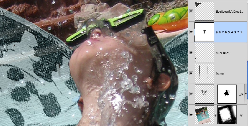
The ruler lines are from Inspired Elements.  I did erase the numbers so I could put the 0 at the bottom to look like I was measuring the height she was bursting upward.
I then added one of the frames from Inspired 2 and stretched it to size using the transform grip. 

The inky butterfly sitting on the letter T in the title?  I used my magic wand with continuous option off, to select the black from the orange butterfly, then did a control J to copy it to a new layer.
Moved it using the Move tool (V), rotated it into position and then erased half of the wings to make it appear like a side view like he was sitting on top of the T.  I like the rub-on or stamped effect this gives.
See here zoomed way in.  Way to extend the stash too!


Miss Bailey's "wings" were created the same way doing this and recoloring the orange to blue.  Then I put those wings on top of her photo, created a layer mask on the wing layer, and using a small round hard brush with black on the mask, I painted in the part of Bailey I wanted to show so it looked like the wings were behind her.  I could have just erased the part of the wings too, but I prefer to use layer masks in case I mess up or don't like it and I can paint back in with white.  Just make sure you zoom in to get close to the edges.  Here's a close up with the layers shown so you can get a visual.


Added my journaling and again picked an orange color from the raft to accent key words.

That was it.  I think the entire layout took me about an hour or so, but I did know the look I was going for and did have my notes in my page booklet for this photo.

Hope you enjoyed a peek into my process and learned something new today.  If you have any questions, please ask!  You can post here or ask in our help forum.  We are always willing to help you create your pages and explain things more in-depth.
Till next time,


PS: If you have read this entire post you must be really interested in this effect.  SO, tell me how you liked the post or something you'd like to learn more about or even how you would use these watercolor splats and I'll randomly pick one commenter to WIN a set of my brushes that I plan on releasing next week. :D


© Cilenia Curtis 1986 - 2012 | Infinite Dimensions | The CAD Wizards
All content is copyright protected and owned by Cilenia Curtis. For permission to use any contents from these pages, please email Cileniac at yahoo dot com.